The PH Artichoke only becomes really interesting once you read it as a lighting machine, not just a luxury shade
With PH Artichoke, the market often starts from the image alone: layered copper leaves, suspended sculpture, hotel-lobby glamour. The reliable sources show something more exact. Louis Poulsen states that Poul Henningsen was commissioned in 1958 to design a pendant for the Langelinie Pavilion in Copenhagen and that the brief was to create glare-free light from every angle. That explains the lamp far better than any later icon language.
This matters in a shop context too. Anyone browsing mid-century·designs for lamps mid-century, Bauhaus or the wider shop will constantly see objects that are visually strong but weakly explained. PH Artichoke is a good counterexample because form, light control and construction all belong together.
The famous leaves are not ornament first, but part of a precise light logic
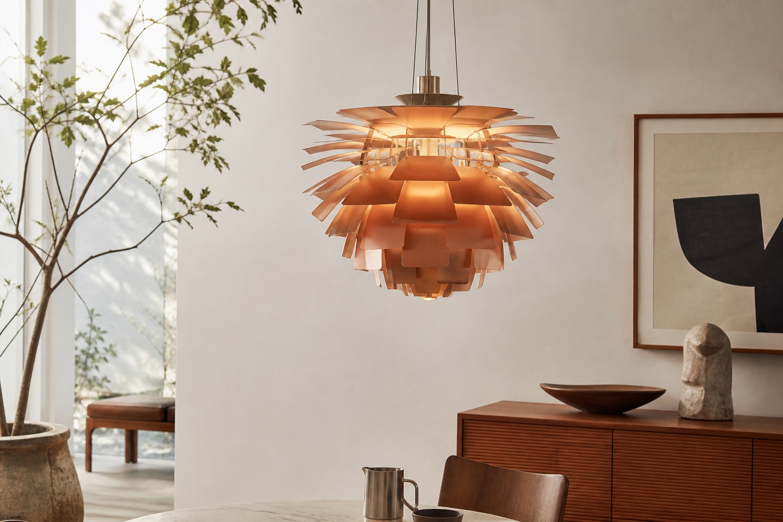
The leaf structure is more than a decorative flourish. Louis Poulsen explicitly connects the lamp’s refined lighting effect to 72 carefully placed leaves. That number is not a trivial brand anecdote; it shows how strongly the design depends on a calibrated sequence of shielding and reflection. The lamp’s name directly follows from that layered, artichoke-like structure.
The Victoria and Albert Museum documents its example as the Artichoke Lamp, made in 1960 in Copenhagen, manufactured by Louis Poulsen and designed by Poul Henningsen. The museum’s physical description is especially useful: the object is made of copper, steel and plastic, with layered copper leaves attached to a frame of curved chromed steel strips. The V&A even describes the structure as a spherical, dodecahedral form. That makes clear that PH Artichoke is not simply a copper object with an attractive surface, but a technically demanding light object.
For buyers of historic pendant lamps, material and leaf condition matter more than the silhouette alone
That is where the practical value begins. On the vintage market, the right question is not just whether a lamp “looks like an Artichoke”. More useful checks are leaf count, fixings, surface finish, reflective inner faces, frame structure and traces of later repair. The V&A stresses that the copper leaves are mounted to the steel framework and that the internal surfaces actively shape the light. Louis Poulsen adds that even on the later black edition, the undersides of the leaves remain white so the light is reflected correctly. In other words, visible colour alone is not enough; light quality depends on less obvious inner surfaces as well.
The larger Henningsen context matters too. On its designer page, Louis Poulsen places the beginning of its collaboration with Henningsen in the 1920s and from 1925 as a lifelong relationship. PH Artichoke therefore belongs to a longer development of the PH system, in which light direction, glare control and everyday usability were thought through systematically. For collectors, that is far more useful than the generic label of a “Danish icon”.