The Valentine becomes more interesting once you stop seeing Pop styling and start reading a portable writing machine with a precise product argument
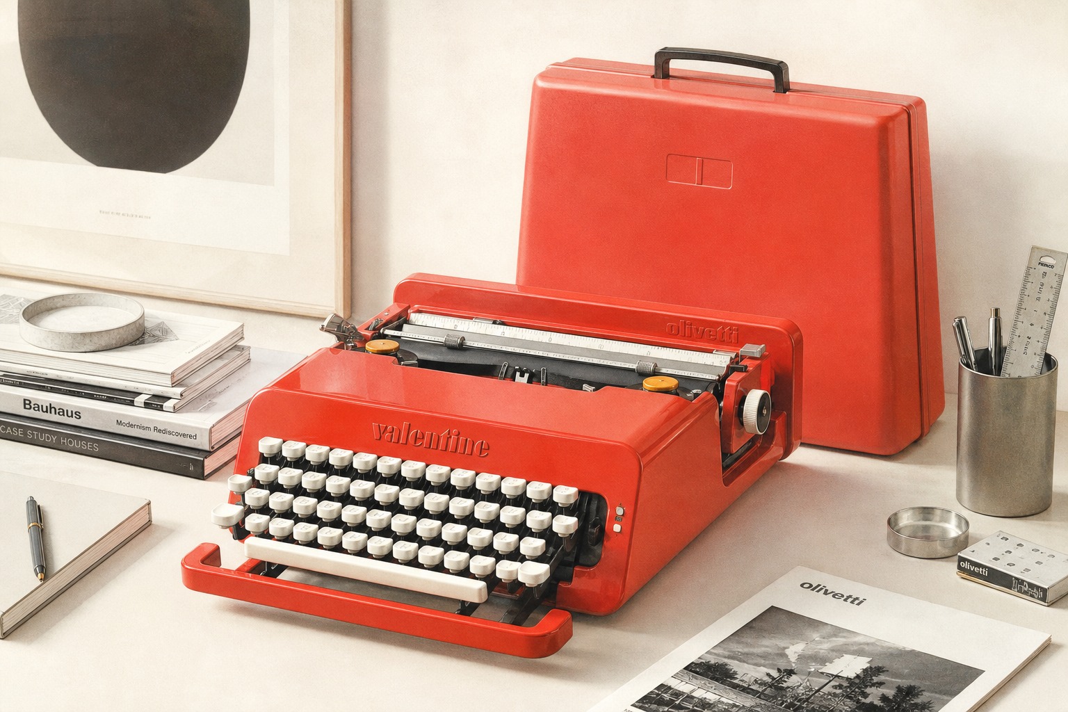
Many texts treat the Olivetti Valentine mainly as a bright red design icon. The dependable sources allow a more exact reading. The Metropolitan Museum of Art catalogues it as the Valentine Portable Typewriter of 1968, designed by Ettore Sottsass and Perry King within the Olivetti context. More importantly, the museum specifies the materials as ABS plastic, synthetic chloroprene rubber and metal. That turns the object from a vague style reference into a concrete industrial product.
That is immediately useful for readers of mid-century·designs. Anyone arriving via vintage typewriter, typing machine or the broader shop will notice how often typewriters are sold through nostalgia alone. The Valentine is better judged when material, mobility and the documented design intention are considered together.
The difference between 1968 and ca. 1969 is not a contradiction, but a useful collecting clue
The Met dates its object to 1968. The Victoria and Albert Museum describes the Olivetti Valentine Typewriter as designed by Ettore Sottsass and Perry King for Olivetti, Milan, and made in Spain, ca. 1969. For buyers of historic objects, that difference is informative: museum dating can reflect the design year, the production launch or the dating of a particular collection example.
In practice, that means a Valentine should not be judged only through claims like “first edition” or “original 1960s”. Better checkpoints are manufacturer context, production clues, material consistency, cover integrity and overall housing condition. Because the sources clearly place the object in the late 1960s, the narrow date range helps more than it confuses.
The red colour was part of a deliberate counter-proposal to the grey office machine
The Design Museum calls the Valentine the “poster child of 60s Italian design” and explains its impact through the bold red case, practical lightweight portability and a stylish, modern design that re-energised the typewriter market. At the Met, that attitude becomes even clearer: Sottsass later said he chose bright red so as not to remind anyone of “monotonous working hours.” The same museum adds that he originally imagined an especially simple and inexpensive portable with no lowercase letters, no bell and a cheap plastic case, although Olivetti objected.
That is the real value for a shop context. The Valentine is not merely red; it is a sharpened critique of the conventional office typewriter. Anyone assessing a historic example should therefore focus not only on the iconic colour, but on carrying cover, key logic, material ageing, completeness and the credible fit between portability and the housing concept.