The Max Bill kitchen clock is best understood as a documented postwar working object, not just a decorative classic
With the Max Bill kitchen clock, the most useful step is to compare the sources instead of repeating market shorthand. Junghans Vintage states that Max Bill designed a kitchen clock for Junghans in 1956, explicitly situating it in the Bauhaus tradition and noting collaboration with students. The Victoria and Albert Museum records its object as a kitchen wall clock with a mechanical timer and names Max Bill and Ernst Moeckl as designers. Taken together, those sources already show that this is more than a nice minimalist wall clock: it is a documented domestic tool positioned between school, industry and daily use.
That matters for buyers because the market often collapses the object into vague labels such as “Bauhaus clock” or “1950s wall clock”. The stronger reading depends on specifics: Junghans as maker, 1956 as design date, timer function and a documented design link to Max Bill, or Max Bill together with Ernst Moeckl. Those details make the object far easier to assess seriously than generic vintage listings.
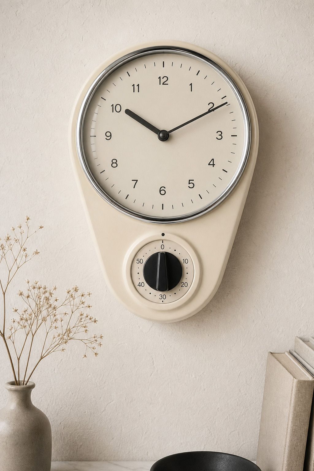
The V&A record shows that materials and operating logic matter as much as the silhouette
The V&A entry is especially practical because it describes the museum object in unusual detail. It lists a glazed earthenware body, a circular glass cover with a chromium-plated rim, the printed JUNGHANS name on the dial and a timer with a 0-to-60-minute scale directly below the clock. The museum also gives measurements for its example: 26 cm high, 18.7 cm wide and 6 cm deep.
That level of description is valuable in a shop context. A Max Bill kitchen clock should not be judged only from the front view. Case shape, glass rim, numeral layout, timer scale, back construction and hanging details all matter. The appeal of the design lies precisely in the combination of ceramic body, strict typography and practical timer function.
Today’s Junghans range explains why the dial is still so recognisable
The current Junghans max bill collection helps explain the clock’s lasting visual authority. Junghans presents the line as timeless German industrial design, stresses the iconic dial and states that the design has remained almost unchanged for around 60 years. Particularly useful is the note on the square numerals: the “4” is described as resembling an upside-down chair, while the other figures follow the same disciplined construction.
For buyers of historical clocks, that is more than brand rhetoric. It shows that recognition comes from very specific design decisions rather than from a vague minimalist mood. When browsing clocks or Bauhaus-related objects at mid-century·designs, it therefore makes more sense to compare typography, functional layout and material consistency than to rely on style tags alone. Related context appears on our Junghans clock page, on Bauhaus and in the main shop.